Your current screen size is
What is my screen resolution?
The numbers above represent the viewport size of your current screen, which is the visible display area of your screen. This is often slightly smaller than your screen resolution. A web design viewport is defined as a rectangular area (measured in pixels) that is displayed on the screen and determines how the content is arranged and where to scroll through the text wrappers or windows to see the entire web page.
Is the viewport the same as the screen resolution?
For most devices, the resolution/size of the screen is the same as the viewport size. This is true for most desktop computers and laptops, but is almost never true for mobile devices and tablets! Many phone browsers scale web pages to a larger screen width to put them on the screen. This is sometimes called overview mode. These browsers allow the user to zoom in and out of the pages to see the bit they want to see. For example, while the screen width of a device can be 320px, the viewport can be 980px wide. In this case, a web page designed for 980px or less will fit across the entire screen. I am typically using 1000px and 690px as the main breakpoints on websites I design as that seems to cover a lot of good ground for most modern devices.
Screen resolution is not a useful indicator for browser window size.
Desktop screens have increased significantly over the last decade, but browser display screens (the visible area in the browser window) pretty much have not. A little while back, CSS-Tricks discovered that only 1% of users have full screen navigation. While only 9% of visitors to this site had a screen width of less than 1200px. Their take is that even though lots of users run big monitors these days, not all of them are viewing websites in ‘full screen resolution’, therefore the viewport size of the website is much smaller than the screen resolution of their monitor.
What is my screen size?
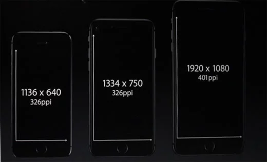
Where the confusion begins with screensizes and viewports is usually due to phone manufacturers misleading consumers:
For a lot of devices, the resolution specified by the manufacturer often doesn’t refer to PPI (pixels per inch) which is a better way to think about resolution. You can see this by looking at iPhone screen sizes for the past few years. The physical dimensions of the screen have hardly changed (see the CSS widths of iPhone 6 compared to iPhone X), but the resolution has increased almost 60%. So what you’re getting is a new device with the same physical size of an older, lower resolution device, but they have jammed much more PPI in to the screen. Following?
Now you’ve read a little more about screen resolutions and device viewports and hopefully I have answered your what is my screensize question? There’s some more good info if you’d like to keep reading on these topics over at the Android website.
If you’d like a detailed list of different devices’ viewport sizes, pixel dimensiosn and CSS widths I’ve compiled all the info I can on this viewports list.